
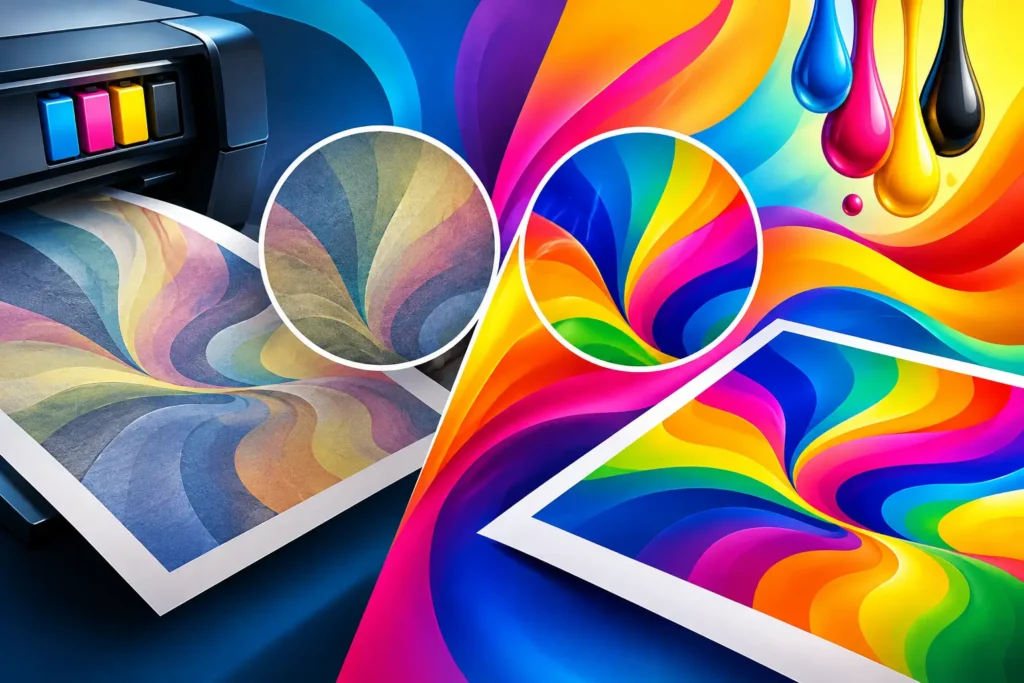
A royal blue logo that comes out grayish. A bright red shirt design that prints more like brick. A flyer that looked perfect on your phone but feels flat when it lands in your hand. If you are asking, “why are colors printing dull,” the issue is usually not one bad setting. It is the gap between what you saw on screen, what your file contains, and what a specific printer, ink, material, and finish can actually produce.
The good news: dull color is usually preventable. Start with the source of the artwork, then match the print method and material to the result you need. That approach saves time, avoids costly reprints, and gets your shirts, stickers, signs, and business materials looking professional.
Why Are Colors Printing Dull in the First Place?
Screens create color with light. They use RGB – red, green, and blue light – and can display extremely bright, electric-looking colors. Print uses ink, toner, pigment, or transfer film on a physical surface. Most commercial print workflows use CMYK – cyan, magenta, yellow, and black – which creates color by absorbing light rather than producing it.
That difference matters. A neon green shown on a backlit phone screen may fall outside the range of colors CMYK ink can reproduce. When the file converts for print, the printer selects the closest available value. The result can look less intense even when the equipment is working exactly as it should.
Material changes the result, too. Ink on glossy white sticker stock reflects light differently than ink on an uncoated business card. A vivid DTF transfer pressed onto a black cotton shirt relies on a strong white underbase. A design pressed onto a heather garment will interact with the garment color and texture. The artwork may be identical, but the finished color will not be.
Start With the Artwork File
Many color issues begin before printing starts. A low-resolution screenshot, a compressed social media graphic, or an image pulled from a website may already have lost detail and color information. Enlarging it can make the design appear faded, muddy, or soft.
For print-ready artwork, use the original vector logo when possible. Vector files such as AI, EPS, SVG, and press-ready PDF files keep logos sharp at different sizes. For photo-based designs, use a high-resolution file sized for the final print. A 300 DPI image at its intended print size is a dependable target for most printed materials.
Color mode deserves equal attention. RGB files can be useful for DTF workflows and certain digital printers that use RIP software designed to interpret RGB values. Traditional paper printing is often prepared in CMYK. There is no one setting that is right for every job, so do not convert files automatically just because someone said “everything must be CMYK.” Ask how the job will be produced. The correct workflow depends on the printer, ink set, substrate, and RIP profile.
Watch Out for Bright Screen Colors
The colors most likely to disappoint are fluorescent greens, electric blues, hot pinks, and highly saturated oranges and purples. They may look amazing online but sit outside a printer’s practical color range.
If a brand depends on a particular color, provide approved Pantone references or a physical sample when available. Pantone matching can improve consistency, but it is not a magic promise across every print process. A spot-color screen print, a CMYK brochure, a DTF transfer, and a UV sticker may each need a separate approved target because they are made differently.
The Paper, Fabric, or Surface May Be the Issue
A print surface is part of the color system, not just a blank canvas. White, smooth, coated stock gives colors the best chance to look crisp and saturated. Uncoated paper absorbs more ink, producing a softer, more natural finish. Neither is wrong. A premium uncoated business card can look excellent, but it will not have the same punch as a glossy flyer.
For apparel, fabric color and fiber content matter. Cotton generally accepts DTF transfers well and produces bold designs when pressed correctly. Polyester can create vibrant results, but certain garments are vulnerable to dye migration, where garment dye moves into the print and alters lighter colors. Blends, fleece, ribbed garments, and textured fabrics can all affect how smooth and vivid a design appears.
Surface finish matters for signs and stickers as well. Gloss can make colors look deeper because it reflects more light. Matte finishes reduce glare and feel refined, but they often appear slightly less saturated side by side. Choose matte when readability, a soft look, or reduced reflection is the priority. Choose gloss when you want maximum visual pop.
Ink, White Underbase, and Print Settings Matter
On dark apparel, the white underbase is what allows bright colors to stay bright. Without enough white beneath the design, yellow may look mustard, light blue may look muted, and red may lose its clean edge. Too much underbase, however, can make fine details feel heavy and leave the print less flexible. Good production is a balance between brightness, detail, and wearability.
DTF printing also depends on well-maintained equipment, correctly cured powder, quality film, compatible inks, and accurate heat pressing. A transfer that is under-cured or pressed at the wrong temperature, pressure, or time can look dull immediately or lose intensity after washing. Overheating can affect certain fabrics and colors, while insufficient pressure may prevent a clean bond.
For paper and signage, ink limits and color profiles control how much ink is placed on the surface. Pushing every CMYK channel to 100 percent does not create a richer result. It often creates a muddy one. Deep blacks, for example, may need a carefully built rich black formula for large areas, while small text should usually use simple black for cleaner edges.
Check Your Screen Before Blaming the Print
If your phone or monitor is set to maximum brightness, nearly every printed piece will look less vivid beside it. Consumer screens can also be overly cool, overly saturated, or set to display-enhancing modes. That makes the file look exciting but unrealistic.
For color-critical work, view artwork on a calibrated monitor in neutral lighting. Avoid approving a print proof under colored LED lights, in a dark room, or next to a bright window. Print is best judged under consistent white light. If you are ordering uniforms, retail merchandise, event shirts, or a large quantity of promotional materials, requesting a physical proof or sample can prevent a surprise on the full run.
How to Get Brighter, More Accurate Print Color
The fastest fix is not always “make the design more saturated.” Oversaturating a file can clip detail, turn skin tones unnatural, and create blotchy shadows. Instead, identify where the color is being lost.
Use original, high-quality artwork. Design with the final material in mind. Tell your printer whether the item will be a glossy sticker, a matte sign, a white tee, or a dark polyester uniform. Share brand color references early, especially for repeat orders. If the job is color-sensitive, approve a test print on the actual material rather than judging a proof on a different stock or garment.
For apparel decorators ordering transfers, use a reliable DTF provider that maintains consistent production settings and can flag artwork concerns before output. At GFX The Print Shop, that practical check matters whether you need a single custom shirt or repeat gang sheets for customer orders. A file that prints beautifully on one material may need an adjustment for another.
When Duller Color Is Actually the Right Choice
Not every project needs maximum saturation. A memorial shirt may call for a softer photo reproduction. A luxury brand may prefer muted colors on thick uncoated cards. A construction sign needs contrast and legibility more than subtle gradients. For restaurant menus, a glossy finish may make food images look richer, but glare could make them harder to read under overhead lights.
The best finish depends on the job. The goal is not the brightest print possible. It is a print that looks intentional, matches the brand or event, and holds up where it will be used.
Before placing a large order, compare the artwork against the real-world surface it will live on. That one step turns color from a last-minute problem into a decision you control.